Typefaces
Story
This custom typography design might look simple at first glance but the process was intricate and precise which required a lot of research and practice with drawing letter forms. There is a very rigid set of rules to follow when designing custom type which made the process not so simple. We first picked words to design and then illustrated them as black letter forms. The next step required us to apply abstract imagery as a fill on the word that also reflected the meaning behind it.
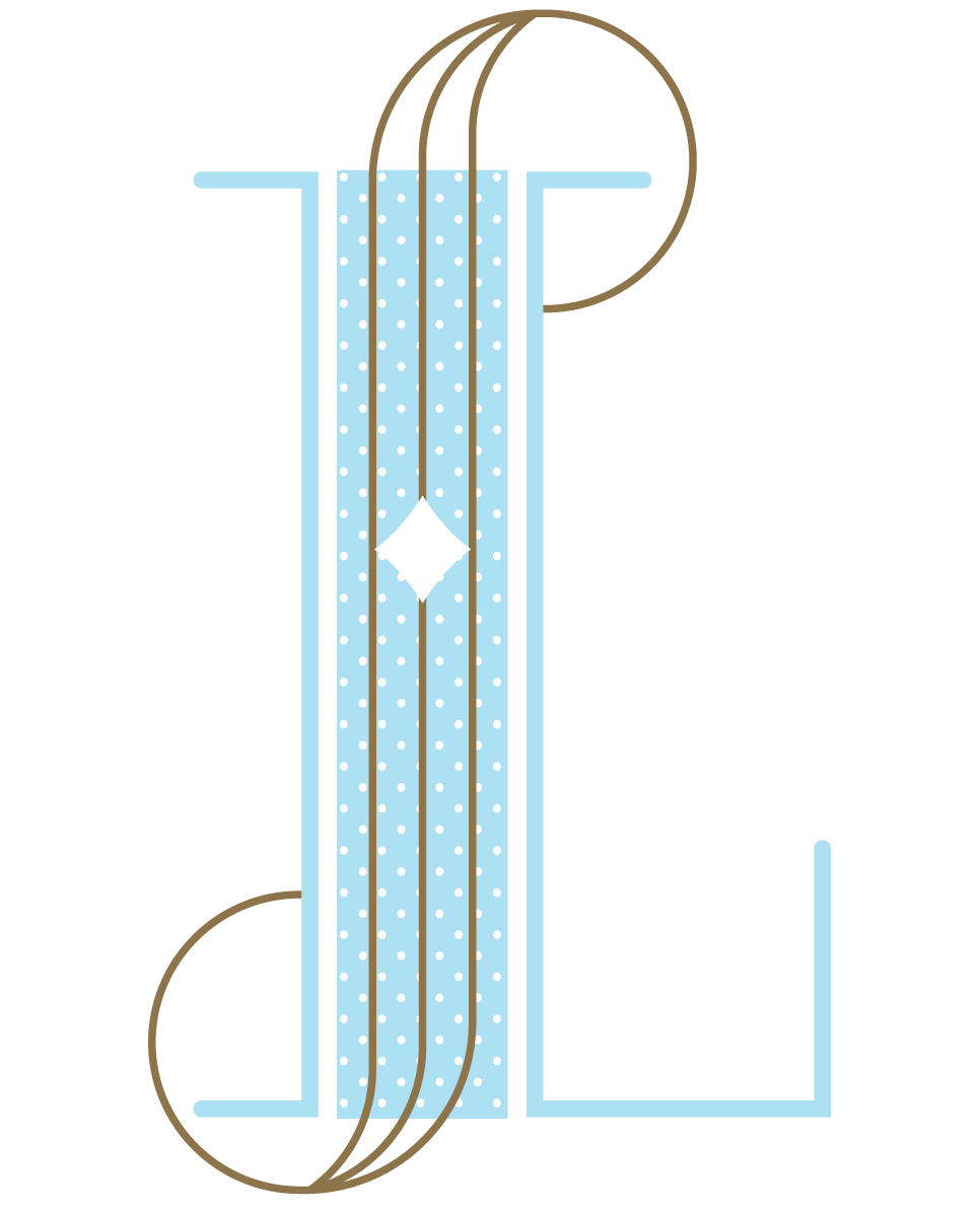
My words were graceful and tasty. From the beginning I kept picturing my graceful, tall letters as ballerina legs with turned out toes (finishing serifs). They are paired with more curvy and round balancing serifs that create a very graceful system. There is contrast in the vertical stem and horizontal widths but the transition is also seamless and graceful.
I approached tasty in a similar way by picturing something yummy as I began to brainstorm. There is a more playful aspect to the designs and elements. the counter space in the lowercase 'a' was difficult to get right because I wanted it round and happy but not a perfect circle. This contrasts with the unique block-y and angular serifs. I applied a blurred photo of m&m's as the fill which adds to its playful and tasty meaning.
The Sequel
The assignment following the type design was to take one of those words and create a promotional poster for a museum with required text. I created a graceful museum event poster using shades of blues and oranges in vertical bars. The text layout on the circle paths supports the graceful feel and ties to the round brackets and serifs of the type design.
Details
Title: Custom Typography
Characters: graceful, tasty
Genre: illustration, typography, abstract, layout
Client: Graphic Design Program - Sacramento State
Editor: Richard Pratt
Publish Date: October, 2012


