4625 Upson Downs Rd.
Newcastle, Ca 95658
916.765.7747
laura smith | designer
Your Custom Text Here
Your Custom Text Here
Story
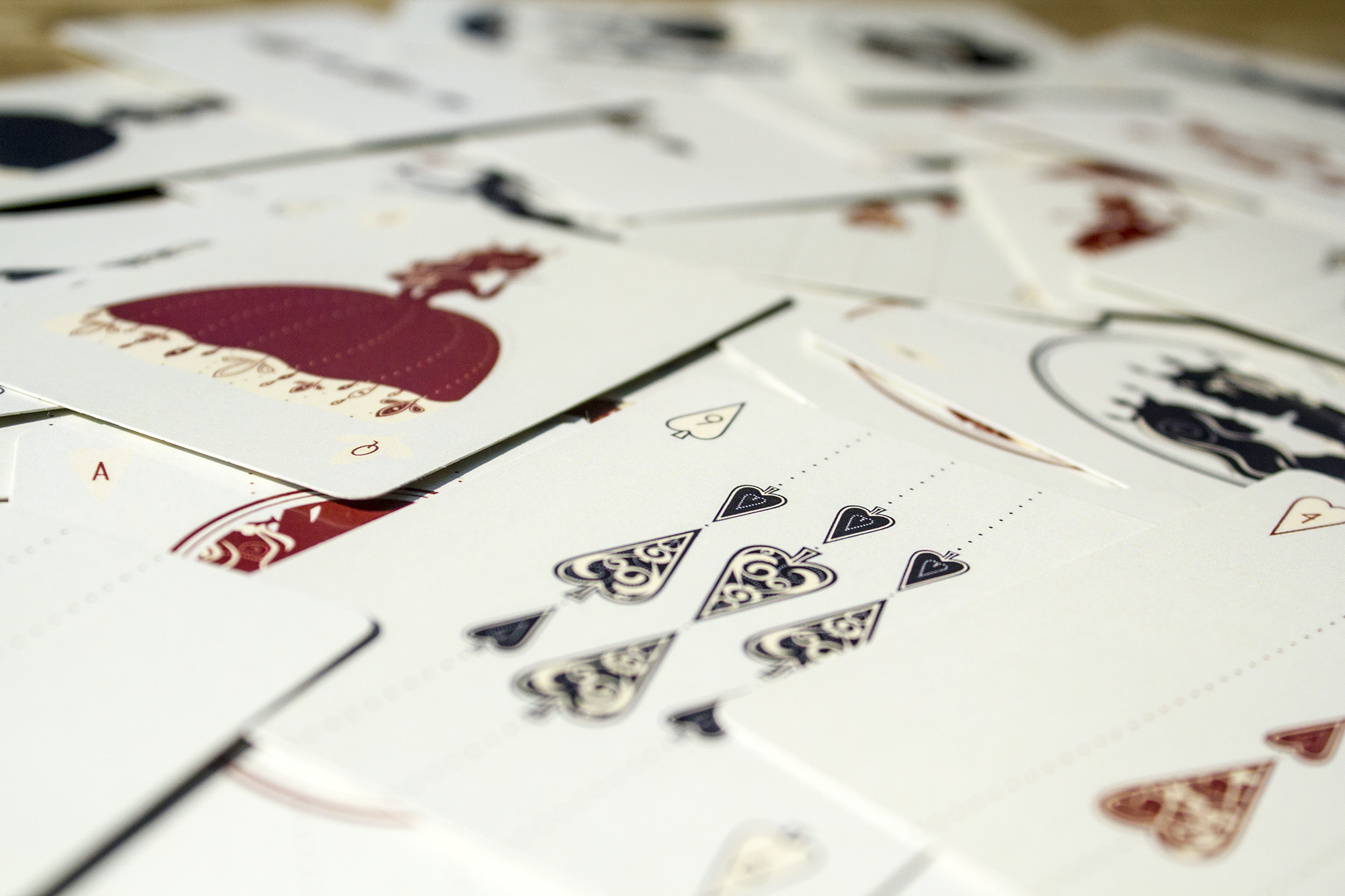
The assignment was to create a set of playing cards, in any style and subject matter. I was initially inspired by a Victorian silhouette illustration that I found during my research. This project quickly turned into one of my favorites when the face cards evolved into characters that represented each of my family members.
Each suit has it's own descriptive and intricate system of illustrative elements that repeat in pattern. They are tied together with a complementary color palette, common line widths and delicate dotted lines. The antique-Victorian style gives it a timeless beauty.
Characters
King: My husband - Daniel Smith
Queen: Myself - Laura Smith
Jacks: Brittni and Morgan
Joker: Wyatt (our gymnast)
Details
Genre: illustration, hand-held
Client: Graphic Design Program - Sacramento State
Editor: Richard Pratt
Publish Date: December, 2013
Story
The idea was to create an integrated campaign for the annual Sacramento Electronic Music Festival (SEMF). This was this first time we were able to use our knowledge of systems and apply it to multiple, functional pieces. This project included a poster, post card, handheld schedule, and an item of our choice (I chose a VIP pass).
Extensive research on this existing venue and of other similar events gave me a variety of directions and themes to take this project. My theme was centered around the experience you would have at this event. I chose to focus on the vibrant energy, connectivity and a mixology of different styles and sounds you see and feel when attending this event.
For the poster I combined photography with connecting illustrative lines that create interesting and eye catching imagery. These lines are symbolic of the connection the viewer has to the music. I wanted a dark night time blue to mimic the dark atmosphere. With a contrasting yellow, I imagined them glowing under a black light. That affect would most likely come into play when attnedees would use the hand held schedule at the event.
Characters
Poster Front: Laura Smith
Poster Back: Sacramento Bridge
Subject: SEMF. music, audience
Details
Genre: illustration, hand-held, typography, photography, multiple
Client: Graphic Design Program - Sacramento State
Editor: John Forest
Publish Date: December, 2013
Story
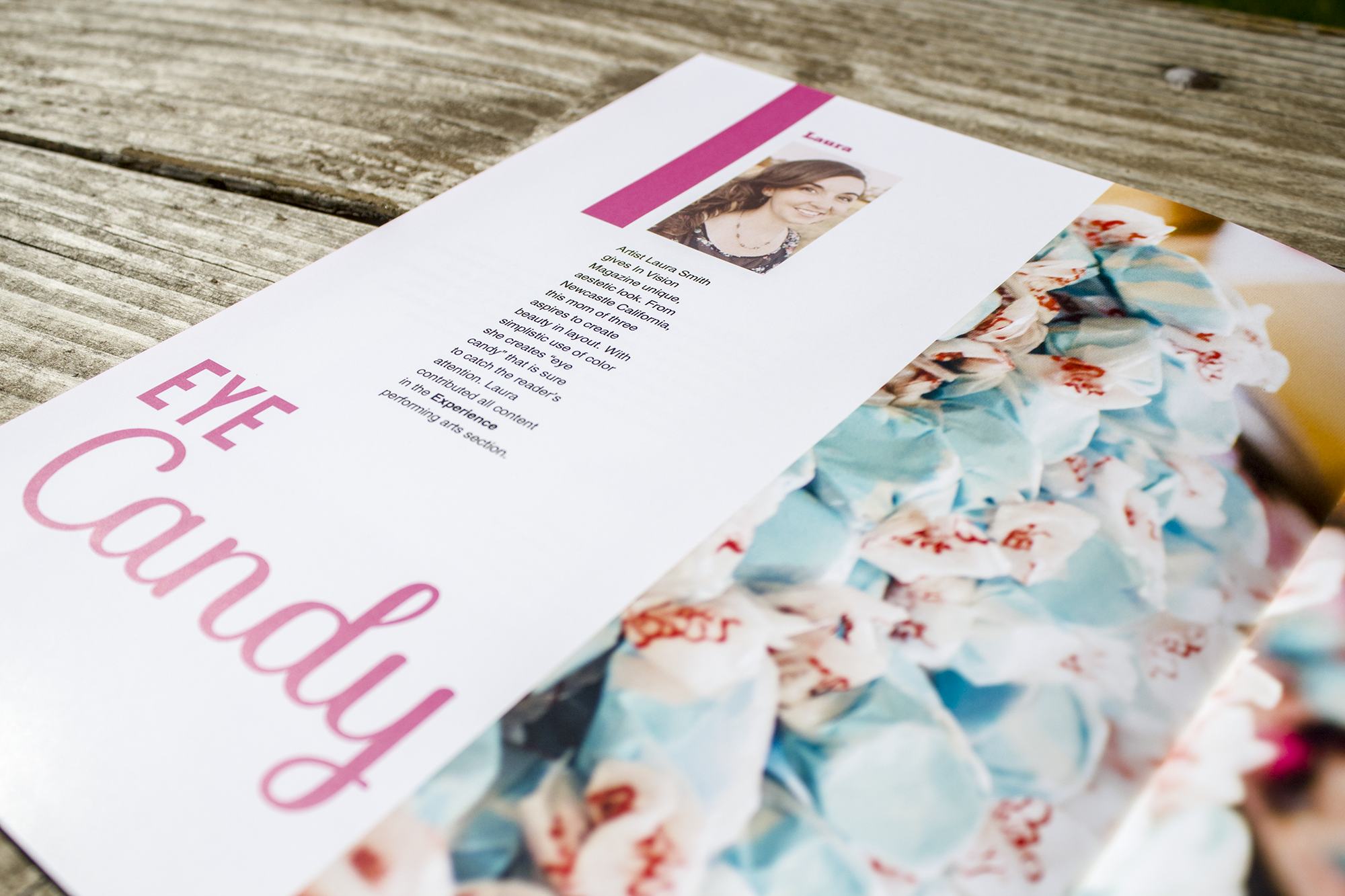
The idea for the magazine was that it would be marketed toward the creative class in the Sacramento region. We worked in groups of four to make overall decisions about the concept and direction we would each take. We each wrote an article to be included and contributed a bank of photos that would go with it. We were then tasked with individually designing our own magazine, using the agreed upon title, direction, the four articles and the accompanying photos.
As a group we decided our articles would focus around events that took place in downtown Sacramento. Our goal was to reach out to the creative community and make them a part of the evolving community that is 'In Vision'. I got really lucky with my group and ended up with great photography for each article. I was inspired by my peers creativity and used the bright/bold color I found in the bank of images to create a system for my layouts. Each section/article is introduced with a title page/double layout that either features an illustration or a beautiful photo.
Details
Title: In Vision
Authors: Laura Smith, Shanna Rossi, Dustin Love, Anton Kiriyak
Cover: Features the midtown artwalk
Chapters: Four articles, three advertisements, one info-graphic piece and dozens of photographs that I took myself.
Subject: Downtown Sacramento
Genre: illustration, hand-held, typography, photography
Client: Graphic Design Program - Sacramento State
Editor: John Forest
Publish Date: December, 2013
Story
This assignment integrated abstract photography paired with type. Choosing a a play, we were tasked to create 3 postcards with a connecting theme. The postcards need to relate to each other within a system; through color, type, hierarchy and overall visual feel. The overall system must included 3 fronts and 1 back of a 4" x 6" postcard.
I chose the play "Cats" and featured three different characters on their own card. This parallels the musical stories featured in the play because each one is about a specific cat. I captured abstract images of textured paper and altered the color in photoshop. There is strong contrast and depth which allows the viewer to imagine a lit space. The colors I chose and the careful attention I paid to the highlights is meant to symbolically connect the viewer to the ally where the cats live on the streets. Rather than portraying the moonlit sky that they might see, I wanted to create an atmosphere with more of a feeling of the moonlit streets. The cream white perfectly highlights the illumination that the moon would create when hitting the streets surfaces. The dark purples and hazy shadows illustrate deep mystery.
Details
Title: Cats
Characters: Skimbleshanks, Macavity, Mr. Mistofetees
Themes: Light, darkness, open-ness, mystery
Subject: Musical Play
Genre:abstract, hand-held, typography, photography
Client: Graphic Design Program - Sacramento State
Editor: Richard Pratt
Publish Date: October, 2013
Story
Our objective was to create two symbols of the same insect to illustrate two different words; elegant and fierce. With extensive research I was able to define and study everything about the honey bee. This assignment was extremely educational, as it was the very first time I was exploring the integration of positive and negative form working together.
My elegant honey bee, which is defined as cleverly simple and graceful in form or movement has a fluid, graceful shape. The elegant pose is a floating profile view and all of it's body parts piece together to form a drop of honey. There are round and fluid curves as well as tapering, smooth lines that ooze elegance.
My Fierce honey bee, which is defined as displaying an intense or ferocious aggressiveness, was quite the contrasting representation. This bee is in a very confrontational pose and sends an almost visceral warning to those who approach him. The sharp point and blade-like limbs reinforce his dangerous stance.
Details
Subject: Honey bee
Dedication: Fierce, Elegant
Genre: illustration, logo, symbols
Client: Graphic Design Program - Sacramento State
Editor: Mario Estioko
Publish Date: April, 2012
Story
This dimensional piece was our first handheld project with imagery and type. Having an informational brochure that you can actually hold creates a unique experience for the viewer. As they open the piece they are revealing the story.
I decided to feature Karl Blossfeldt's for this project with selected biographical info as well as some of his beautiful black and white photography. I designed a system using interval, repeating vertical lines and blocks of color to reveal Karl's story. My goal was to make the photos be the first to stand out and have the text be a supportive and functioanl element.
Details
Series: The Aperture Master's of Photography Series
Subject: Karl Blossfeldt, photography
Excerpt: "Art and Nature, the two great manifestations in the world around us, are so intimately related that it is impossible to think of one without the other."
—Karl Blossfeldt
Genre: hand-held, typography, photography, dimensional
Client: Graphic Design Program - Sacramento State
Editor: Richard Pratt
Publish Date: April, 2013
Story
The project was a great way reinforce how a visual story can sell a book. The cover of any book is what the reader first sees and it must catch the reader's eye. The design should be smart and appealing and it should carry a system throughout the book.
Considering the imaginative subject matter of the actual story, I had many options for themes and illustrations. I ultimately went with Alice on the cover in an upside down position to create a feeling of topsy turvy. I added a light swirl pattern in the background to mimic the disorienting feeling Alice finds in wonderland. The complementary blue and yellow illustrate a soft, sweet girl and the pop of red symbolizes how different wonderland is from her own world. The typography is appropriate for the story as well with capital letters serifs on the title almost feel like characters from the book.
Details
Characters: Alice, The Cheshire Cat
Subject: Alice's Adventures in Wonderland
Genre: illustration, hand-held, typography, photography, book
Client: Graphic Design Program - Sacramento State
Editor: Richard Pratt
Publish Date: April, 2013
Story
This custom typography design might look simple at first glance but the process was intricate and precise which required a lot of research and practice with drawing letter forms. There is a very rigid set of rules to follow when designing custom type which made the process not so simple. We first picked words to design and then illustrated them as black letter forms. The next step required us to apply abstract imagery as a fill on the word that also reflected the meaning behind it.
My words were graceful and tasty. From the beginning I kept picturing my graceful, tall letters as ballerina legs with turned out toes (finishing serifs). They are paired with more curvy and round balancing serifs that create a very graceful system. There is contrast in the vertical stem and horizontal widths but the transition is also seamless and graceful.
I approached tasty in a similar way by picturing something yummy as I began to brainstorm. There is a more playful aspect to the designs and elements. the counter space in the lowercase 'a' was difficult to get right because I wanted it round and happy but not a perfect circle. This contrasts with the unique block-y and angular serifs. I applied a blurred photo of m&m's as the fill which adds to its playful and tasty meaning.
The Sequel
The assignment following the type design was to take one of those words and create a promotional poster for a museum with required text. I created a graceful museum event poster using shades of blues and oranges in vertical bars. The text layout on the circle paths supports the graceful feel and ties to the round brackets and serifs of the type design.
Details
Title: Custom Typography
Characters: graceful, tasty
Genre: illustration, typography, abstract, layout
Client: Graphic Design Program - Sacramento State
Editor: Richard Pratt
Publish Date: October, 2012
coming soon
Story
The goal of this website was to create a system throughout a series of pages for any architectural structure using basic HTML5 code and simple CSS. We needed to create a unique experience for the viewer that used elements of the structure in the design.
I was drawn to the Florence Cathedral and inspired by the beautiful stained glass and Gothic style arches and ceilings. There is a mathematical feel to the overlapping circles that create arches on the header and the multi-color fills are reminiscent of the stained glass decor throughout the Cathedral. Each page is tied together with the same grid and header but differ in color from page to page.
Details
Title: The Florence Cathedral
Genre: illustration, web, architecture, layout
Client: Graphic Design Program - Sacramento State
Editor: Richard Pratt
Publish Date: May, 2013
Story
Working as a team of four we were directed to develop or reinvent a brand personality of a chosen company. Research marketing strategy led us to brainstorm and produce various touch-points that could be used to gain brand awareness. Creating a brand book to accompany the touch-points helps document the brand concept, graphic standards and multidimensional application. The brand book also establishes the company morals, goals, mission and vision which are all essential for a business that wants to gain a specific audience and grow.
Our group decided to start a new honey business in the Sacramento area and we were inspired by an east coast existing company called beelove. We took their name and applied our own mission and vision to create a whole new company.
Characters
Logo: The beelove symbol encompasses many aspects of our company and attributes. The wings incorporate the letter B and a heart representing beelove. The body of the bee was inspired by a honey dipper and the dripping fluid motion of the symbol resembles liquid honey.
Touch-points: identity with business cards, stationary, website, honey jars with labels, honey spoons and suckers, gift boxes, sample sets, cough drops, tea boxes, recipe books, gift cards, gift bags, aprons, store front, mailer
Pattern: watercolor cheverons, watercolor washes, watercolor dripping honey, and hexagons
Words: serene, heartfelt, down to earth, wholesome, delightful
Details
Title: beelove
Authors: Laura Smith, Shanna Rossi, Hayley Lyons, Natalia Dzyndra
Themes: bee, love, serene, heartfelt, down to earth, wholesome, delightful
Subject: company branding
Genre: Print, group, identity, packaging, system
Client: Graphic Design Program - Sacramento State
Editor: Myung
Publish Date: April, 2014